Brand Colors
Below is a listing of the DaVita brand palette for use on the web and the SASS variables/hex associated with each color.
WCAG Color Accessibility Spreadsheet
-
Neutral
Slug: neutral-900
Hex: #000000
Slug: neutral-800
Hex: #414141Slug: neutral-700
Hex: #7d7d7dSlug: neutral-600
Hex: #757575Slug: neutral-400
Hex: #b2b2b2Slug: neutral-300
Hex: #dfdfdfSlug: neutral-200
Hex: #efefefSlug: neutral-100
Hex: #ffffff -
Blue
Slug: blue-900
Hex: #283764
Slug: blue-800
Hex: #004c80Slug: blue-400
Hex: #0069b1Slug: blue-200
Hex: #00a8e4 -
Orange
Slug: orange-800
Hex: #ce3616
Slug: orange-accessible
Hex: #c46b1cSlug: orange-400
Hex: #ee8000 -
Pink
Slug: pink-900
Hex: #800834
Slug: pink-800
Hex: #980b3eSlug: pink-400
Hex: #d20f55 -
Yellow
Slug: yellow-800
Hex: #b58900
Slug: yellow-400
Hex: #f5d800 -
Aqua
Slug: aqua-800
Hex: #0f606f
Slug: aqua-400
Hex: #128094 -
Purple
Slug: purple-800
Hex: #2b143f
Slug: purple-400
Hex: #641580 -
Green
Slug: green-800
Hex: #2d4e00
Slug: green-400
Hex: #779f09 -
Red
Slug: red-800
Hex: #d20f30
Slug: red-400
Hex: #ef0015
-
Primary
Slug: primary
Hex: #0073e6 -
Secondary
Slug: secondary
Hex: #ff6600 -
Tertiary
Slug: tertiary
Hex: #9900cc -
Gray-light
Slug: gray-light
Hex: #efefef -
Neutral
Slug: contrast
Hex: #414141
Slug: base
Hex: #ffffff
-
Custom Grey Transparent
Slug: custom-grey-transparent
Hex: #efefef → transparent -
Custom Grey Dark Transparent
Slug: custom-grey-dark-transparent
Hex: rgba gradient -
Custom Grey Dark Transparent Blog Post Hero
Slug: custom-grey-dark-transparent-blog-post-hero
Hex: #F6F6F6 → transparent
Typography
DaVita utilizes a custom Bree Bold font and various weights of Lato. The below example shows heading and copy sizes that are used throughout the site in RTE (rich text editable) areas as well as the web fonts themselves. Headings in components may be larger than the base sizes for text content listed here e.g. Hero Band H1
All headings use the neutral-800 (#414141) variable as their base color.
Heading 1 – 72px – Bree DaVita Bold
Heading 2 – 40px – Bree DaVita Bold
Heading 3 – 32px – Bree DaVita Bold
Heading 4 – 20px – Lato Bold
Heading 5 – 18px – Lato Bold
Heading 6 – 16px – Lato Bold
Paragraph text – Lato Regular – Neutral-800 (#414141)
Typography Preset Large – 30px
Typography Preset Medium – 24px
Typography Preset Small Medium – 18px
Typography Preset Custom Size – 14px
Typography Preset Custom Size – 12px
Typography Preset Custom Size – 10px
Navigation
Main navigation

Main navigation (Search bar open)

Main navigation (Megamenu open)

Utility navigation

Utility navigation (Megamenu Open)

Login menu (Not logged in)

Breadcrumb

Text Links & Buttons
Below is a representation of the base link style as well as a list of the most commonly used buttons on the site. The Tranparent Buttons are used inside of the Image Tout component and Secondary Hero Band component.
Text Link – blue-primary (#0069b1)
Footer links

Graphical Elements
Footer – Social Icons
These icons, featured in the global footer, link to the various DaVita social channels.

Custom Blocks / Global Elements
CTA Large titles
Eating Out Guides
See kidney-friendly food and drink choices to consider when eating out at your favorite restaurants. Choose from 12 cuisine types.
Download Cookbooks
Access free kidney-friendly cookbooks from DaVita dietitians.
CTA Image Right
Get the Transplant Smart Booklet
Transplant Smart is a multimedia kidney transplant education program for DaVita patients to help them understand more about this important treatment option. Even if you’re not a patient, you can access in-depth information about kidney transplants from the free Transplant Smart guide today.

CTA Large text with icon & button
See if you’re at risk for kidney disease in 60 seconds or less
1 in 7 adults in the U.S. has chronic kidney disease (CKD) and most don’t know it.1 A CKD diagnosis may come as a surprise because the symptoms are often subtle. Take this short quiz to learn if you may be at risk.
Icons card grid
Icons card grid with bordered
Icons Grid Five Columns
CKCC Benefits to Nephrologists
The CKCC model design is similar to other value-based care programs, but offers some specific benefits for nephrologists:
Nephrologist-centric model
Favorable payment incentives for nephrologists
Improved care for their patients
Improved clinical outcomes
Smooth transitions to dialysis
For more information or to apply, contact us at CMMImodels@davita.com.
Icons Grid Three Columns With Button
I’m Interested in a Kidney Transplant
Whether you’re on dialysis or haven’t started yet, consider the benefits of transplant among your treatment options.
I’m Interested in a Kidney Transplant
Whether you’re on dialysis or haven’t started yet, consider the benefits of transplant among your treatment options.
I’m Interested in a Kidney Transplant
Whether you’re on dialysis or haven’t started yet, consider the benefits of transplant among your treatment options.
Icons Grid Two by Two
DaVita offers a variety of treatment options to fit your schedule. Call us at 1-800-244-0680 to find out which ones are available near you.
In-center hemodialysis treatment takes place in our state-of-the-art dialysis centers.
In-center nocturnal dialysis allows you to dialyze in-center overnight three times per week while you sleep.
Home dialysis options offer the flexibility and comfort of dialyzing at home.
Kidney transplants are an ideal treatment option we aim to help every eligible patient pursue.

DaVita is a national sponsor of Living With Diabetes
Did you know 60% of people with kidney failure also have diabetes? Learn more about the connection between these conditions and steps you can take now to protect your kidney health.

Flexible column
Leadership development program designed to develop high-potential nurses, clinical coordinators or clinical nurse managers into operational managers via classroom learning, on-the-job shadowing, coaching, mentorships and more.
Tagline – Large

Tagline With Text

Convenient care to fit your lifestyle — wherever you may be.
Static Map With Marker
Accordion
Accordion content
Protected Download Button
With registration link.
Without registration link.
Media & Text Color

Top 15 Healthy Foods for People with Kidney Disease
Media & Text Border
Free Cookbook: Diabetes- and Kidney-Friendly Eating, Vol. 2
Managing diabetes and kidney disease? Get healthy, flavorful recipes from DaVita and the American Diabetes Association in this second edition of the popular Diabetes- and Kidney-Friendly Eating cookbook. Download your free copy today!
Article slider blue background
Article slider gray background
Lorem ipsomd dolor site amit
Video playlist
Bing Search
Search
Enter a search term above to search DaVita.com
Card

Bordered Card
Card description

Default Card Without Border
Card description
CTA Tile
CTA Tile: Box
CTA Description
CTA Tile: Over Image
CTA Description

CTA Tile: Card
CTA Description
CTA Tile: Card without image
CTA Description
CTA Tile: Card without image
CTA Description

CTA Tile: Card without image
CTA Description
Carousel
Gallery Carousel – Without thumbnail
Gallery Carousel – With thumbnail
Dialysis center finder
Kidney Smart®Class finder
Recipe
Recipe Search Header
Find a Kidney-Friendly Recipe
Recipe Header
Web Styleguide
Recipe Slider
Recipe List
Note: The filters accordion may not function as expected in this block, as it’s intended for use within the recipe archive only.
Find a Kidney-Friendly Recipe
Refine Results By:
-

NUTRIENTS PER SERVING
Angel Food Cake Surprise
This easy Angel Food Sherbet Cake uses just three ingredients and is a delicious dessert that can fit into a kidney-friendly diet.
-

NUTRIENTS PER SERVING
Breaded Fish Sandwich
Enjoy a crispy, oven-baked cod fillet sandwich, a delicious alternative to a classic fried fish sandwich, while providing 26 g of protein.
-

NUTRIENTS PER SERVING
Sausage, Egg and Cheese Bagel Thin
The easy, kidney-friendly breakfast can be a quick meal, morning or evening.
-

NUTRIENTS PER SERVING
Baked Donuts 5 Ways
Bake a batch of delicious homemade donuts today! This easy recipe bakes in just minutes and you can customize with your favorite toppings.
-

NUTRIENTS PER SERVING
Strawberry Milkshake
Satisfy your sweet tooth with this treat! This creamy strawberry drink is a kidney-friendly decadent milkshake and is also sugar-free.
-

NUTRIENTS PER SERVING
Tuna Melt Sandwich
Enjoy a delicious and kidney-friendly tuna melt! This easy-to-make recipe features low-sodium tuna and fresh vegetables.
-

Download Free Cookbooks
Get instant access to recipes and kidney diet tips from DaVita dietitians.
Over 1,000,000 downloads so far!
-

NUTRIENTS PER SERVING
Burrito Bowl
Looking for a fresh and easy weeknight dinner? This kidney-friendly chicken burrito bowl recipe features a zesty chipotle dressing.
-

NUTRIENTS PER SERVING
Hamburger Salad
Enjoy all the classic flavors of a cheeseburger in this quick and easy salad! The limited amount of cheese, helps keep it kidney-friendly.
-

NUTRIENTS PER SERVING
Pad Thai
Craving homemade Pad Thai? Get our simple, kidney-friendly, recipe for perfectly cooked noodles and a savory sauce.
-

NUTRIENTS PER SERVING
Chicken, Fruit and Poppyseed Salad
Looking for a healthy and delicious meal? Try this easy-to-make chicken salad with a twist of fruit and a flavorful sugar-free poppyseed dressing.
-

NUTRIENTS PER SERVING
Crunchy Southwestern Breakfast Wrap
A delicious, protein-packed breakfast wrap. Ground meat, fluffy eggs and potatoes folded in a tortilla and seared to a golden-brown.
-
NUTRIENTS PER SERVING
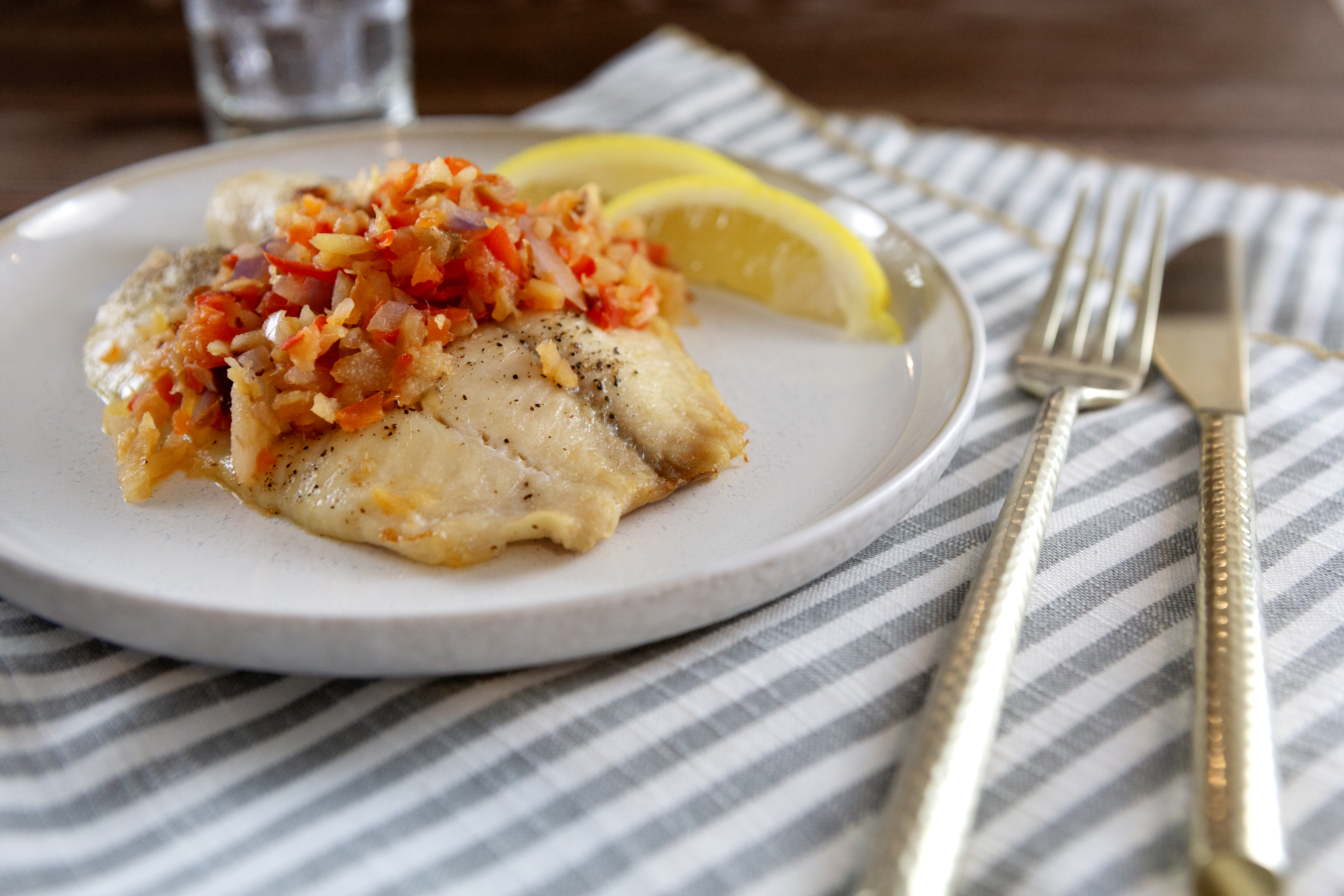
Tilapia with Grilled Pineapple Salsa
Try our simple baked tilapia, perfectly complemented by a tangy grilled pineapple salsa. A kidney-friendly delight!
What Stage Am I In?
There are five stages of kidney disease. Your glomerular filtration rate (GFR)–considered by medical professionals to be the best measure of kidney function–lets kidney care experts figure out your stage of kidney disease. Understanding it can help you learn how to take control and make any change to certain lifestyle habits in order to possibly slow the progression of your condition. Determining your GFR levels requires a simple blood test. Use this GFR Calculator tool to help you determine which stage of kidney disease you are in currently.
What Your GFR Result Means
Completely healthy kidney function is measured at a glomerular filtration rate (GFR) of around 100, which means that the kidneys are working at 100 percent. Your kidney function is still considered normal if the GFR number is 90 or greater. If your GFR is 45, you know that your kidneys are working at approximately 45 percent of the normal rate.
Understanding your GFR can help you learn how to take control and slow the progression of your condition.
